Choosing Mishpacha
Brand Design

OVERVIEW
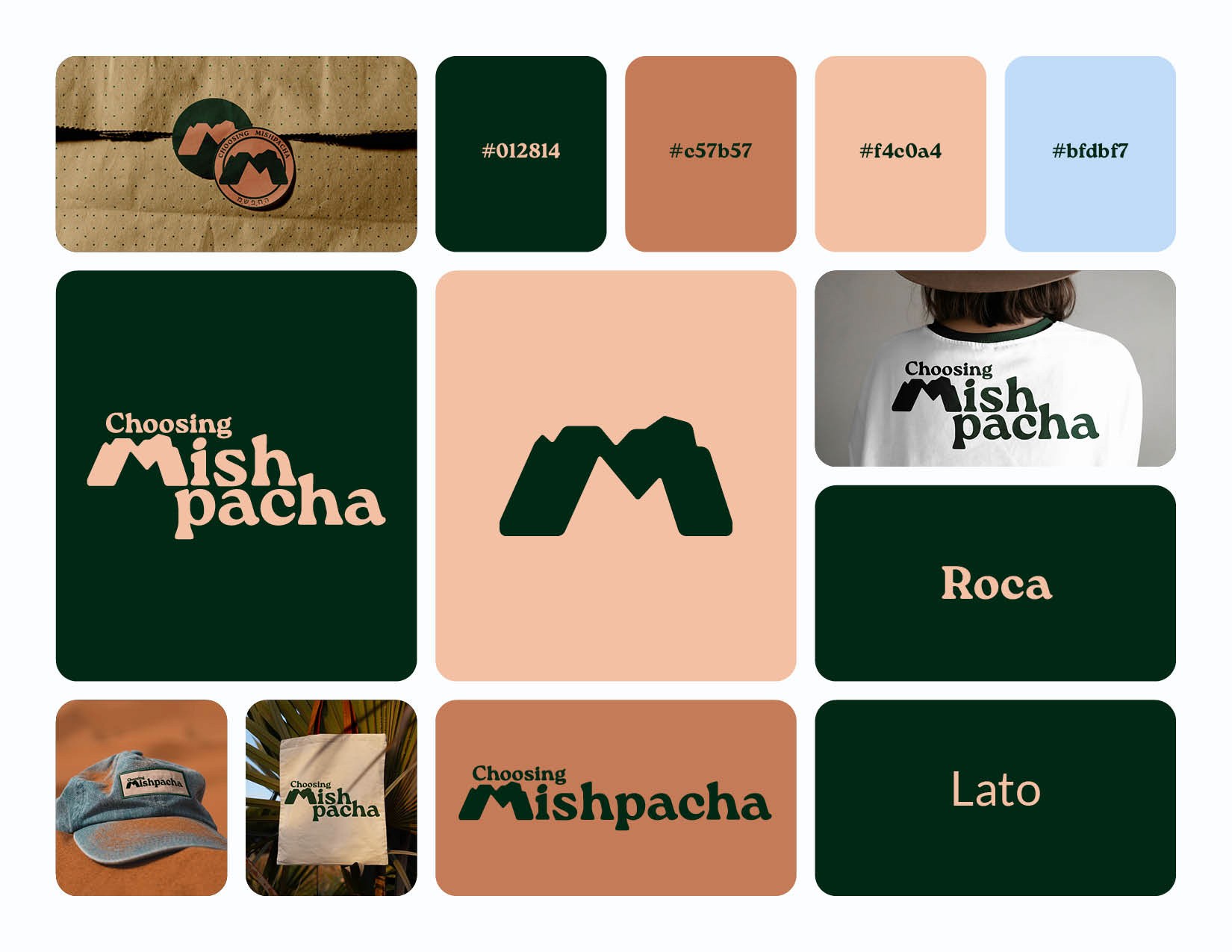
Choosing Mishpacha teaches ancient principles to deepens family connections. This coaching business believes we can develop stronger relationships by having hard conversations, choosing each other, and enjoying healthy recreation outside.

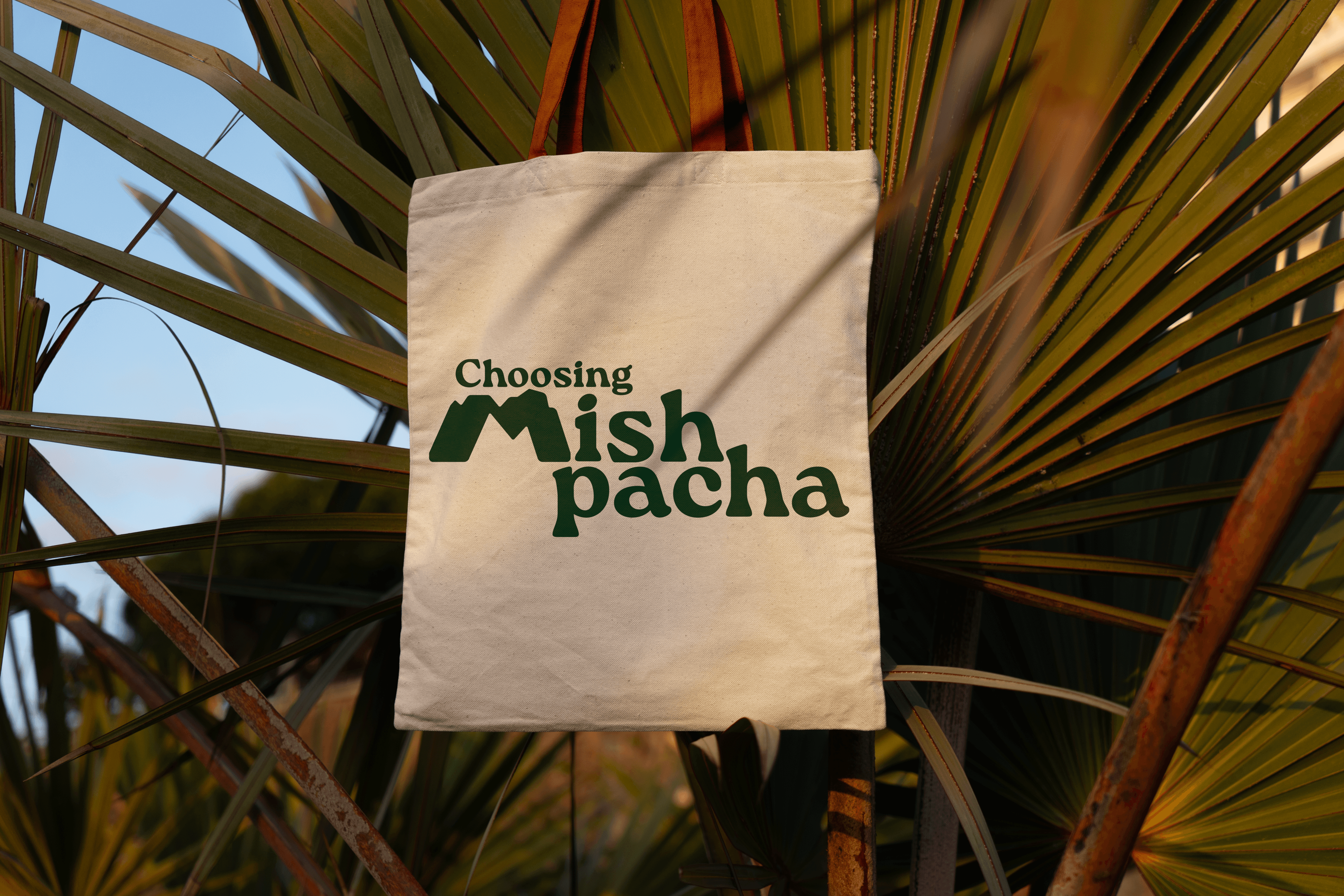
Rachel Townsend, founder of Choosing Mishpacha hired me to create a brand identity. Mishpacha is the Hebrew word for "family" so I aimed to keep hebrew traditions at the core of the brand. The main "M" logo mimics the shape of Mount Sinai, a meaningful location for the Jewish people. The brand system that surrounds it includes natural colors and a font with letters that look as if they're reaching out to hold the hand of a loved one.