The Hidden Superpower of Growing Businesses: Brand Consistency

Have you ever scrolled past an Instagram post, recognized exactly who posted it without looking at the username, and kept scrolling? Or maybe you walked into a store and instantly felt a certain mood just from the typography on the walls and the color of the shopping bags.
That is not a happy accident. That is the magic of brand consistency.
When business owners are first mapping out their companies, they often ask us: why is brand identity important? Is it just about having a pretty logo to put on a website?
At Dinosmore Studio, we like to say that a great logo is just the handshake. Consistency is the actual relationship. Let’s talk about why making your brand look and feel the same across every single touchpoint is the ultimate shortcut to building customer trust.
The "No-Logo" Test: What Makes an Identity Unforgettable?
A common mistake is thinking your logo needs to do all the heavy lifting. In reality, a truly premium brand identity should be completely recognizable even when the logo is not in the room.
Think about it this way. If you stripped the logo off your packaging, your website, and your social media graphics, would your customers still know it was you?
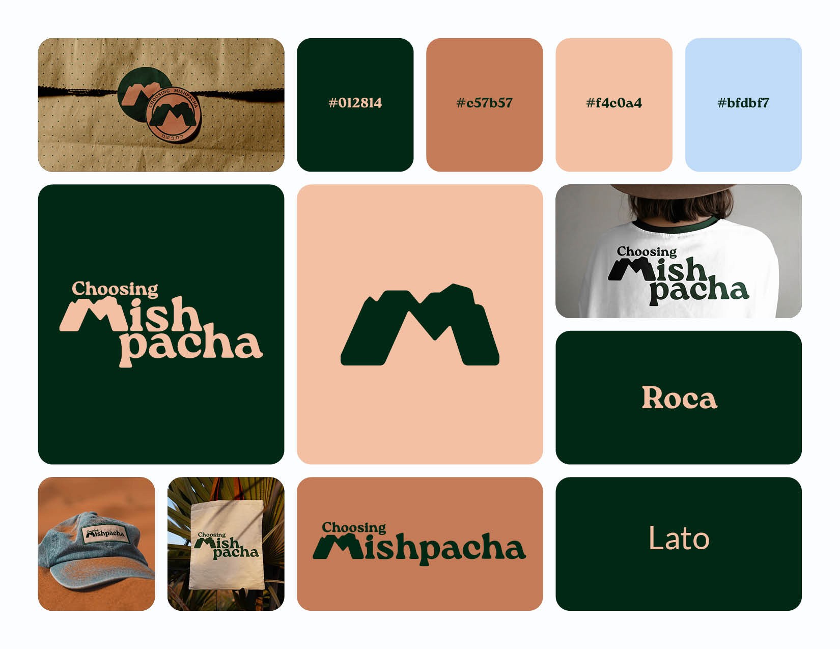
A cohesive brand identity uses a dedicated toolkit to build recognition without screaming your company name. This system relies on a unified approach to a few core elements:
Color Uniformity: Using the exact same color hex codes on your website, your business cards, and your tissue paper so your brand feels instantly familiar.
Typography Rules: Sticking to two or three signature fonts that match your brand's personality, whether that is playful, elegant, or hyper-professional.
Visual Direction: Using a consistent style of photography, graphic patterns, or illustration styles across every digital and physical layout.
When you repeat these elements over and over, you create a visual language. That language breeds familiarity, and familiarity breeds trust. If your graphics look wildly different on every platform, it sends a subconscious signal to customers that your business might be disorganized or unreliable.
How Can a Small Business Improve Its Brand Design on a Budget?
We get it, when you are first launching, funds can be tight. You might be wondering: How can a small business improve its brand design on a budget?
The absolute best way to elevate your branding without spending a fortune upfront is to ruthlessly enforce a set of rules for yourself. Pick two clean fonts. Choose three colors. Create a simple grid layout for your social media posts. The secret here is constraint. By resisting the urge to change your fonts and colors every time you create a new graphic, your business will instantly look more established and polished than competitors who are changing their style every week.
While this DIY discipline is a fantastic bridge when you are first starting out, there comes a point where your business goals will outgrow a basic color palette. To truly scale and compete at a high level, investing in a professionally built visual strategy pays massive dividends over time.
Let’s Build a Brand That Sticks
Consistency is what separates a passing hobby from a household name. When you give your audience a predictable, beautiful, and professional experience every single time they interact with you, you make it incredibly easy for them to choose you over the competition.
If you are starting a business and need a brand identity that turns heads and builds lasting trust, we would love to help you build the foundation. Contact us today at Dinosmore Studio, and let’s collaborate on a fun, professional visual system that is built to scale.